
You can take your reviews galleries to the next level with some simple stylized customizations. This article will describe how WPBR uses CSS Grid to make tweaking the layouts simple with very little code.
What We’ll Accomplish
Galleries can be really effective at drawing attention to information that you want your reader to read. But sometimes, a giant wall of blocks can make a reader’s eye gloss over and they shift into skimming mode. How can you avoid that?
When it comes to your reviews gallery, you can introduce some visual cues to draw attention to reviews that really stand out, or simply make the gallery have some compositional flow so the reader is more engaged rather than eye-rolling.
This tutorial will introduce you to some of the basic methods used in WP Business Reviews so you understand how to use simple CSS styles to create a customized look and feel for your galleries. We’ll go through three different designs that get increasingly more complex to highlight how far you can go with CSS.
How WPBR Uses CSS and How to Tweak it
Before we jump into the designs themselves, let’s discuss the primary method we use to execute these layouts.
CSS Grid
CSS Grid is a modern CSS technique that many developers are now implementing. It provides a way to do grid layouts with CSS that formerly required tables or floating elements and design hacks. The WP Business Reviews gallery layout depends on CSS Grid extensively.
NOTE: We also use “flexbox” a bit, but that will not be needed for this tutorial.
If you want to learn more about CSS Grid, Mozilla has a great introduction and learning by example is always useful as well.
Pseudo Classes
Pseudo-classes have been around for a very long time. The one that most people are familiar with is “a:hover.” The “:hover” part is called a pseudo-class. Many people do not realize there are dozens of available pseudo-classes that can help you narrowly target elements of your page in powerful ways. In this tutorial, we use the pseudo-classes to target specific review items in the gallery and produce different layouts.
Lastly, while there are many ways to implement custom CSS on your website, we’ll be primarily using the WordPress Customizer. I recommend this often to those learning CSS because it allows you to type CSS directly on a screen and see the results applied immediately and live. This makes the Customizer an excellent learning tool.
With that in mind, let’s jump into our examples. Each example is embedded with CodePen. CodePen is wonderful tool that allows you to tweak or fork any of the examples directly on the screen here. You can see the result live as well by clicking on the “Result” tab. If you don’t see the tiles, adjust the Zoom options at the bottom (1x | 0.5x | 0.25x).
Basic Mosaic Styles
See the Pen WPBR Basic Mosaic Styles by Matt Cromwell (@mathetos) on CodePen.
This style does just a couple of things to illustrate how easy it is to customize these layouts with CSS Grid. Here I simply forced the first review to span the width of the whole gallery and alternated background colors for the rest.
This simple example highlights several important principles in using Pseudo-classes and CSS Grid:
- The
:nth-child()Pseudo class allows us to target one exact review. In this case we put “1” in there and it targets the very first review of the gallery - The
grid-columnproperty defines how this single review is targeted alone.
So, the first thing we do is force that first review to span the width of the gallery. Target that review with the nth-child(1) pseudo-class, and assign it the grid-column property.
That’s it! If you copied and pasted that first line from the CodePen above in the Customizer you should see the first review spanning the width of the gallery immediately.
The next bit of code in the CodePen adds some color. Since these are social reviews, we’ll use this “Social Media” color palette from colourlovers.com.
There’s a lot going on there, but it comes down to a CSS principle called “specificity.” Essentially, in order to override the default styles that WPBR has, our styles have to be more specific somehow. It also helps that the Customizer loads all these styles AFTER the WPBR styles are loaded (which is the “cascade” part of “Cascading Style Sheets”).
The next example expands on this example and makes it a bit more complex and visually attractive.
Better Mosaic Styles
See the Pen WPBR Better Mosaic Styles by Matt Cromwell (@mathetos) on CodePen.
One thing that makes grids look so nice is when they are stacked both vertically and horizontally. This example shows how to do that.
We’ll keep the the grid-column from the first example, but this time we’ll add some grid-row to this example.
The trick with stacked reviews is that some reviews are longer than others. So here’s a few things to keep in mind to configure your Collection for optimal stacking:
- Set the “Review Length” setting to be as long as possible to include all of the text of your longest review.
- Set the “Review Order” to “Menu Order.” Then use the plugin “Intuitive Custom Post Order” to drag and drop arrange your single reviews into the order you want. See our docs on that here.
With your reviews in order, use the :nth-child() class to target the longer reviews so they span at least 2 rows, like this: grid-row: span 2.
The code that follows after that is again related to adding the types of colors we want to see.
More Tutorials
We discover new ways to use WPBR every day. We’ll share new tutorials with you and more in our newsletter.

Piet Mondrian Styles
See the Pen WPBR Piet Mondrian Styles by Matt Cromwell (@mathetos) on CodePen.
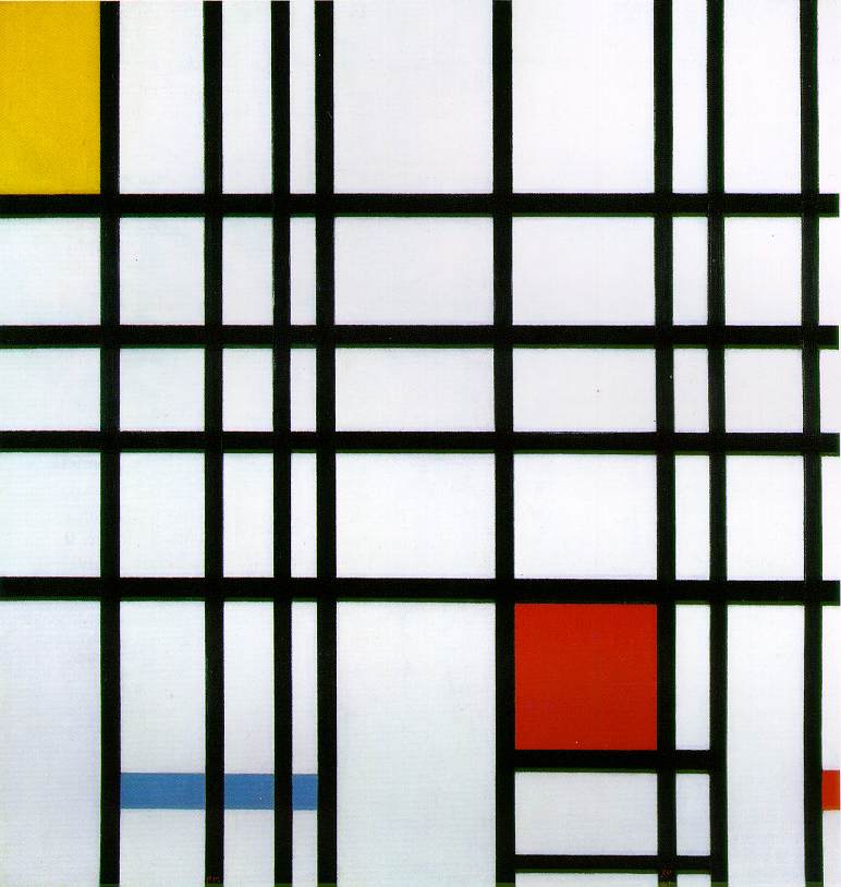
To really take this method to the next level I thought it’d be fun to emulate a great artist: Piet Mondrian. You may not recognize the name, but you’ll recognize the art instantly:
This style uses the :nth-child() class to its fullest to apply the background colors sporadically in a Mondrian-esque style.
It also highlights one limitation of CSS Grid. The spec for CSS Grid doesn’t currently handle borders well when the grid-gap is set to “0.” So for this effect to look really smooth, we set a grid-gap of 10px, and padding of the main grid element to 10px as well, and apply a background color to simulate the equal-width borders.
Go Style with Confidence
We plan to release many more themes and layouts for WP Business Reviews this year. But until then, this tutorial ideally gives you to the confidence you need to experiment with the styles and really make your Collections pop.
If you’ve done some customizations to your Collections, link to it in the comments, we’d love to share them on our social media channels.